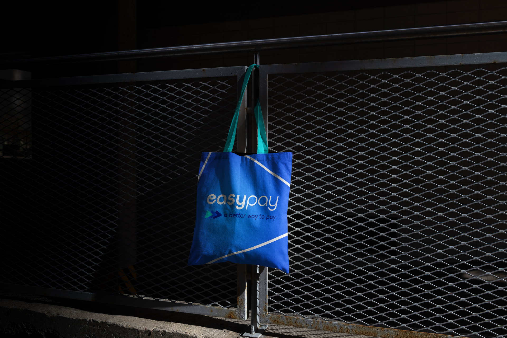
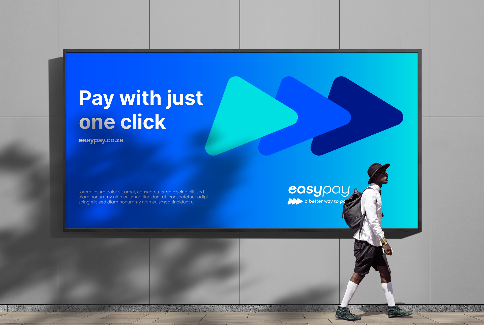
The revision of the EasyPay logo is aimed at better aligning it with the Lesaka brand, all the while maintaining the distinctive identity of EasyPay. Notable alterations consist of a more contemporary font featuring rounded letterforms, which strengthens the visual association with the Lesaka brand. By streamlining the 3 arrows and rounding their edges, this design element now exudes a bolder and striking aesthetic. In general, the updated logo conveys a modern, innovative, and forward-looking feel.