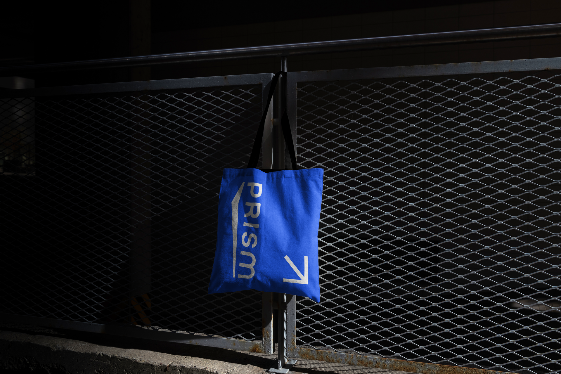
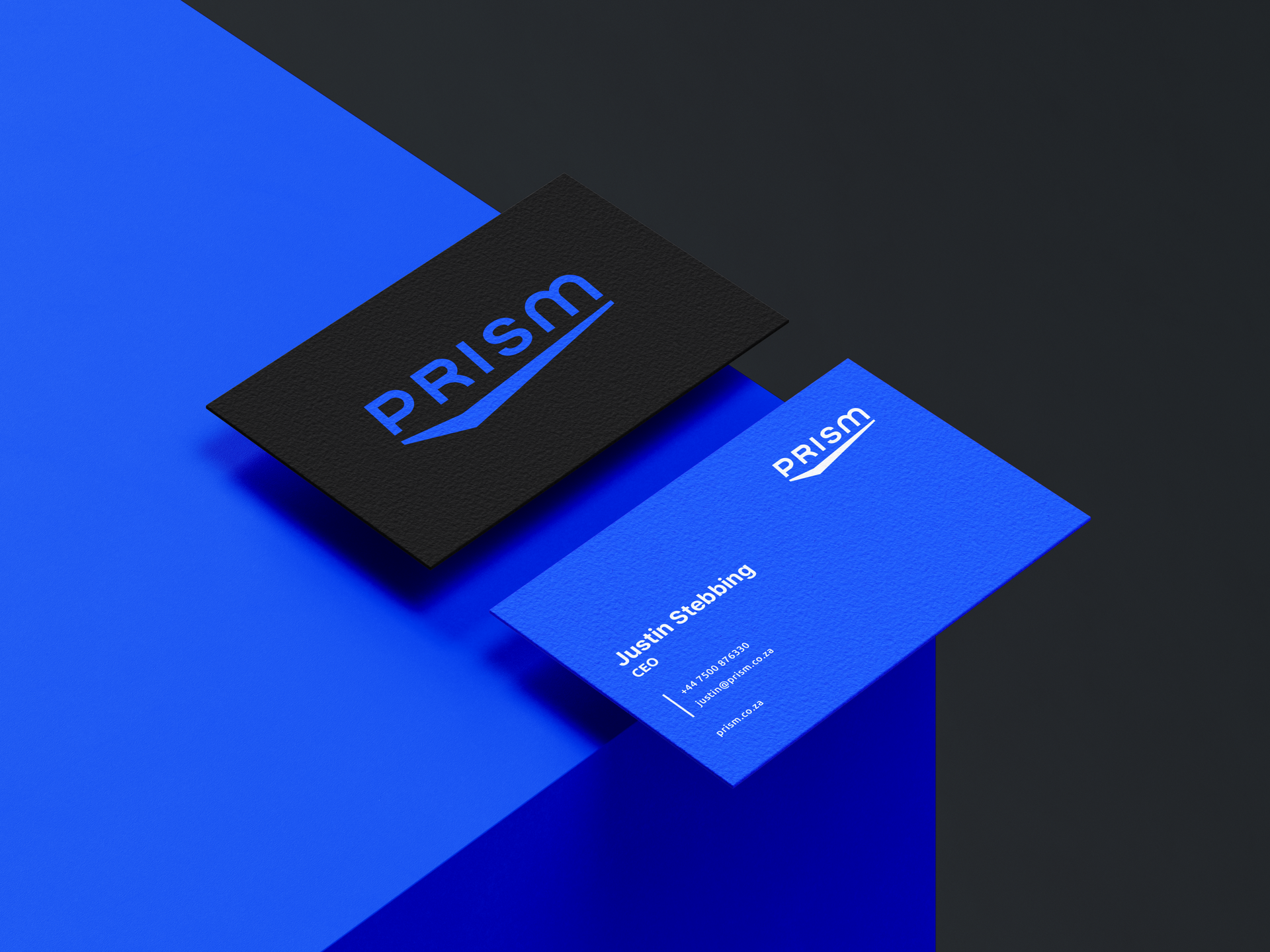
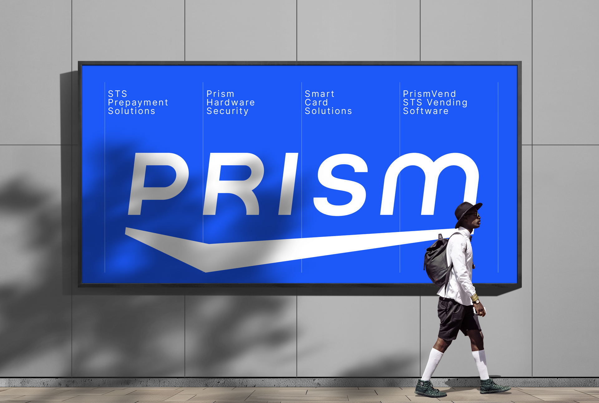
The update to the Prism logo is focused on aligning it more closely with the Lesaka brand while preserving the established Prism brand identity. Key changes include a modernised font with rounded letterforms, enhancing the visual connection to the Lesaka brand. The 'prism' element below the wordmark has also been made more prominent and bold, giving it a stronger presence. Overall, the new logo reflects a modern, innovative, and forward-thinking approach.